PROJECT: Check-Mig Digital Immigration System (Ministry of Foreign Relations - Colombia)
ROLE: All UX Roles
WORK BY: Justin G.L. Dumlao
DURATION: Feb-April ‘24
Introduction
Processing international and domestic travelers at Colombia’s borders as quickly, efficiently, and as safely as possible with the use of a digital immigration form.
Overview
Paul threw his hands up in frustration. “I’ve tried 3 different devices and I’m still getting errors!” He looks at the clock in his office, and notices how much time hes spent on filling out Colombia’s online immigration form.
“I started this 30 minutes ago?! I don’t have to time for this right now I have to finish my work!” He abandons the process and reminds himself to come back later.
Paul’s childhood friend-group are all taking a vacation to Cartagena, Colombia together in order to celebrate the last few weeks of bachelor-hood for one of their own. A rare vacation without his family, there’s a little anxiety in the air, so the last thing Paul wants to worry about is whether he’s even going to be let into the country. He has to figure out this digital immigration form soon.
I was the UX Designer working independantly to recommend ways to improve user satisfacation and trust for Colombia’s Check-Mig Digital Immigration system.
The Problem
A streamlined, efficient, accurate, and reliable system for managing incoming travelers is important for Colombian national security. However, negative user reviews from social influence drivers (Reddit, blogs), suggest that the Check-Mig system has problems that lead to a lack of user trust in the site’s legitimacy.
User frustration has also opened the door for unofficial businesses to make money from our mistakes by creating websites that offer a “Check-Mig form-filling” service; charging travelers to fill out the (free) form for them, while putting traveler data at risk.
The Goal
Suggest improvements to the Check-Mig system that would reduce time on task by at least 15% and improve system usability scores above the industry average of 68.
Research
“Where/When in the process are travelers getting confused the most?”
We started research with this question and utilized a Heuristic Analysis to find some answers.
Common themes noticed during analysis, were problems adhering to form fill-in best practices; specifically, around building trust, writing useful and clear instructions, organization of questions, and clear affordances on the form’s input fields.
Conducting a Usability Test helped to confirm some of our assumptions of trouble-areas on the website and supplied us with the user stories/quotes that would help illustrate those problem areas and also help uncover other opportunities for improvement.
Direct quote 1: “Which one is the real, official website?” (Trust/ Security)
Filling out the Check-Mig form is free, but blog and Reddit posts warn other travelers to watch out for competitor websites that offer a service to complete the Check-Mig form for them, but with a $40 charge.
Direct quote 2: “This form is chaotic!” (Conversation)
Contradictory instructions and unfamiliar field labels confuse users. What interaction is required? Does the user type or do they select from a list? Do the field labels make sense to those traveling from other countries?
Direct quote 3: “There were some tricky drop-downs.” (Appearance/ Affordances)
Users on a desktop didn’t know that some input fields were drop-downs due to unclear instructions and no controls (signifiers) to indicate the type of interaction.
Ideation
Crazy 8s
Paper Wireframes
Storyboards
How it Works
Trust/Security : Now, when Paul reaches the website thru a Google search, the website copy uses “official language” and seeks to assure him with both a privacy policy link and a customer service contact link. Paul knows he is on the correct page and feels a little safer in sharing his data.
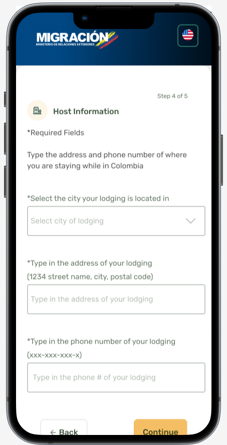
Clear Instructions: Descriptive and direct instructions tell Paul what information to have on hand and the correct action he should take (“Select from a list” or “type”). No more contradictory language (“enter and select”). Greyed out fields prevent any change errors from occuring.
Proper Affordances/Signifiers: Permissible values and field labels clarify how Paul should properly enter his information and clear affordances and signifiers tell him where to take action (drop-down arrows).
Results:
A form that is easier to understand and engenders trust with users, could help to improve task times, user satisfaction, and overall success rate of the Check-Mig system.
More travelers who fill out the form accurately and successfully, leads to the increased efficiency of each border protection agent when screening passengers, and also improves the accuracy of data collected, which reduces costs for data storage waste.
Improved data accuracy also leads to increased safety of the Colombian border as well as for the travelers who enter the borders.
User Impact
36.2% change (reduction) in average task time
System Usability score improvements over the 68 industry average
Links to the privacy policy and a customer service e-mail, both helped improve trust and usage.
Clear instructions reduced user error, which improved user success rates and accuracy of the data collection.
Faster processing at the border, means travelers being able to enjoy vacation sooner and with less headaches.


